Why Your Apps All Look the Same (and Why it Matters)

.png)
.png)
Over the past ten years, anyone who has looked down at their phone screen has likely noticed how difficult it has become to tell app icons apart. Once, a home screen might have been crowded with unique shapes, textured logos, and even playful designs that made each brand stand out immediately. Today, that same screen often appears as a neat but oddly repetitive grid of bright, flattened icons that look so similar that it’s often easy to tap the wrong one.
The icons of common apps like Google, Slack, Chrome, and Photos have all been redesigned in recent years to match this stripped-down style, and clearly, this shift did not happen by accident. Designers and branding experts point to several overlapping pressures that help explain how logos everywhere have ended up looking so much alike.
- Mobile-First Scalability
One of the clearest reasons for this wave of sameness is that icons must now work on a huge range of devices and sizes. In the early days of computing, designers could include textures, shadows, and tiny details without much risk that they would be lost or distorted.
However, on modern screens, an icon must still be recognizable when reduced to the size of a tiny browser tab, a phone shortcut, or even a smartwatch face. Any small detail or fine line often disappears entirely at that scale.
As a result, designers have moved toward flat, bold shapes and solid colors that hold up better no matter how small the icon gets. This also keeps file sizes lower and improves how quickly screens can load, which makes sense given how many devices now depend on high-speed performance.
In addition, more people now use custom icon packs or launchers to give their screens a uniform look, which means brands that keep their icons simple are more likely to blend in with this rising trend of user customization.
- Brand-System Consistency
The demand for consistency within entire brand families has also played a major role in the move toward uniform icon design. Companies like Google provide one of the clearest examples of how this works.
In the past, each Google service looked different. Today, every icon for Gmail, Drive, Docs, Meet, and more follows the same four-color scheme and geometric shapes. The idea is to remind users that each part belongs to the same whole system.
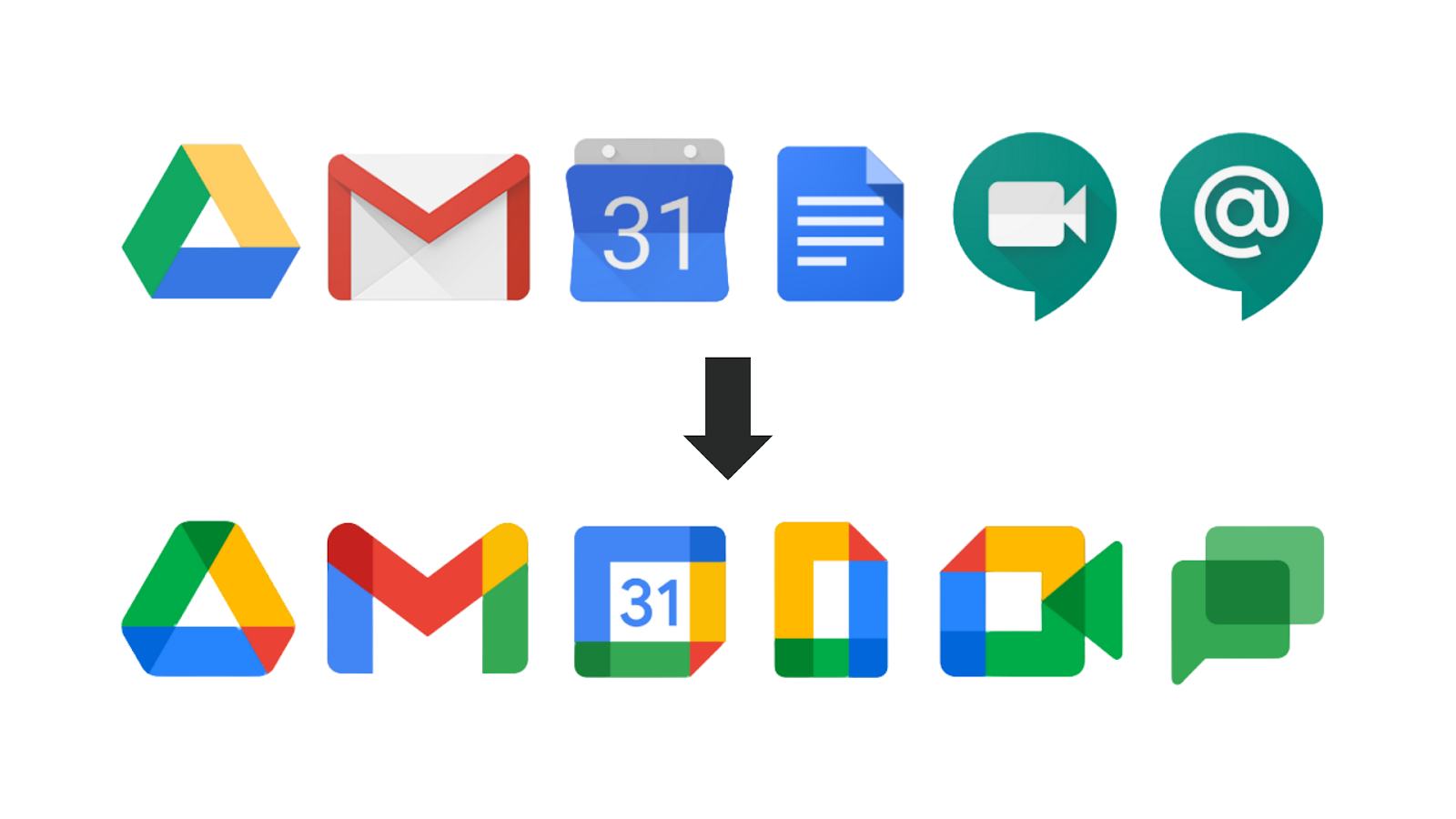
Slack made similar changes by simplifying its once quirkier hashtag into a cleaner version that better matches the rest of its design system. Small variations still exist, such as Chrome’s slight color tweaks on different operating systems, but these changes are carefully controlled to strengthen the sense that all the tools belong together. This helps companies maintain a unified identity across many products, which they see as more important than letting each icon stand alone.
- Global Localization and Efficiency
Companies also know that icons must be instantly recognizable to users around the world, regardless of language or cultural background.
Flat colors, basic geometry, and clean lettering tend to translate well in every market. This design approach removes the need for local adjustments that might otherwise add complexity or cost. With a flatter design, brands can reuse the same visuals for campaigns and products in dozens of countries without worrying that small cultural details will confuse users or carry the wrong meaning.
In practical terms, this approach reduces production time and marketing costs. A simple, bright icon can be animated more easily and resized for any purpose without losing quality. These practical advantages mean that companies trying to grow internationally are often unwilling to risk more detailed or regional designs that could limit their reach.
- Legal and Marketing Safety
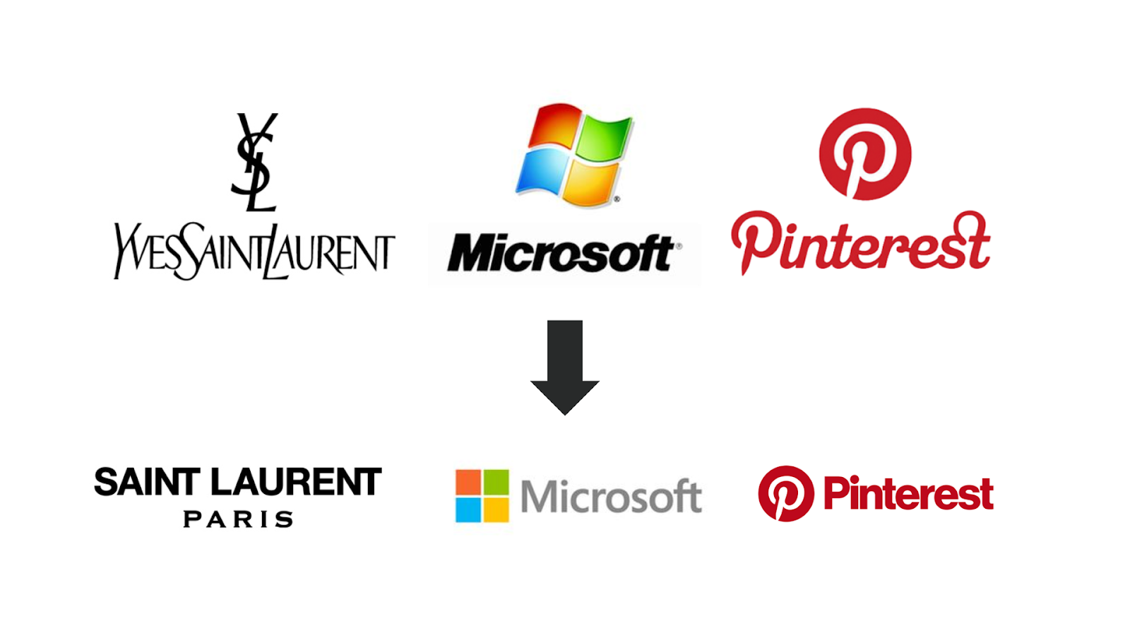
Another factor that has pushed companies toward minimalist icons is the legal and practical challenge of protecting a logo across many regions. Simpler shapes are easier to trademark because they stand out clearly and are harder to copy without being noticed. Complex logos with shadows or multiple textures are not only more difficult to defend legally but are also more likely to be misused, cropped, or recolored by mistake.
For many large companies, the easiest way to guard against misuse is to remove details altogether. However, this same choice has also led to what many critics now call “blanding,” where companies make logos so safe and generic that they lose the distinct personality that once made them memorable. This has created a tension between protecting a brand and keeping it recognizable in a world full of lookalike designs.
- Fashion Cycles and Flat Design Ideology
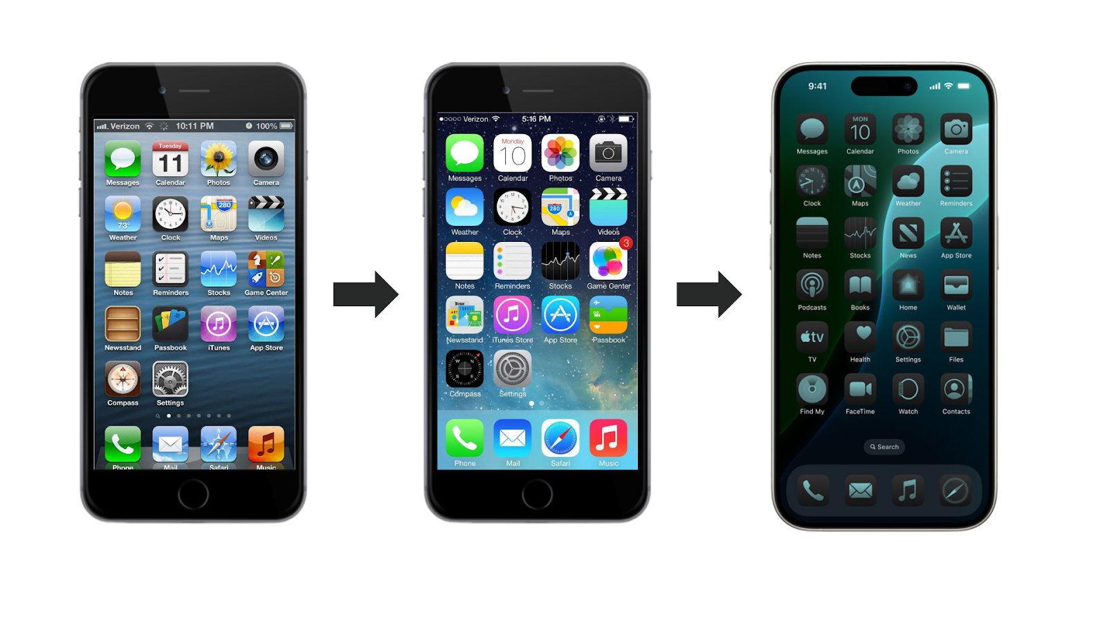
Although practical needs explain much of this shift, it would be unfair to ignore the role of design trends themselves. Much of the current wave of flattened icons can be traced back to Apple’s decision in 2013 to drop its old skeuomorphic style for a clean, flat look in iOS 7. This single redesign helped redefine what a modern digital product should look like.
Google’s Material Design guidelines pushed the trend even further, encouraging an entire generation of designers to embrace minimal shapes and bold color blocks. Startups quickly copied these ideas and even color schemes to appear innovative and in step with big tech companies.
Over time, this cycle created an industry standard where any brand wanting to look up-to-date felt pressured to adopt the same flat style. While the first wave felt fresh and modern, many designers now question whether the trend has become too rigid to allow for more interesting ideas.
The Criticisms
The spread of flat design has also led to clear criticisms from both designers and everyday users.
One common complaint is that icons are now so similar that people often open the wrong app by mistake. For example, someone trying to find Google Drive might tap Google Photos instead because both icons share the same four colors and simple shapes. Critics argue that when companies focus too much on internal branding rules, they forget that icons need to help users find what they want quickly. Google’s decision to force the same four-color pattern onto every Workspace app shows how far some companies will go to keep a system looking unified, even if it makes everyday tasks more confusing.
Another worry is that companies have traded away the small quirks that once made them feel unique. When every icon looks the same, the brand’s personality can vanish too. In the long run, this loss could weaken the bond between users and brands, which has historically been reinforced by memorable visuals that spark recognition and trust.
Is This Here to Stay?
The stride toward uniform and “safe” app icons was driven by clear business and technical pressures like scalability, consistency, reach, and greater design trends. In solving those problems, however, many brands have created a much larger one: stripping away specific visual cues that can help users navigate quickly and feel more connected to a specific identity and point of view.
Brand leaders and designers shouldn’t completely avoid any of these trends in a response to the critiques, but instead use simplicity sparingly and deliberately. Keep icons flexible enough to work on any screen or display, but resist the urge to erase every quirk or human touch. More memorable color choices, distinct silhouettes, and the inclusion of texture can be key differentiating factors between brands that are instantly recognized and those that get completely lost.
Design trends will of course continue to shift over time, but the need for brands to stand out won’t. The brands that succeed will be those that adopt the efficiencies of modern design and technology without forgetting that distinctiveness and uniqueness is part of their usability.
I’m Jared Garelick, a 2025 Summer Design and Marketing Intern at The Ricciardi Group and a rising Junior at Washington University in St. Louis. As part of my internship, I had the opportunity to explore and write about a topic that interests me, which led me to research how design trends have led to the minimalist takeover in current logos and icons.